When you pay attention to what’s around you, it’s stunning that other people don’t see.
Read Morestudio practice
After a banquet...
How something comes to be sometimes has nothing to do with how it started….
Read MorePleasure is the answer....
It takes what it takes…
Read MorePossible?
You don’t know if it can work. So you try to make it work….
Read MoreONE QUESTION - Anthony Palocci, Jr.
One of the best painters painting the best things…
Read MoreUseful drawings #6
These come in handy….
Read MoreSome things you can't forget, and some things you shouldn't....
Who gets a monument?
Read MoreSo... this happened today...
It happens sometimes without your knowing the it’s going to happen….
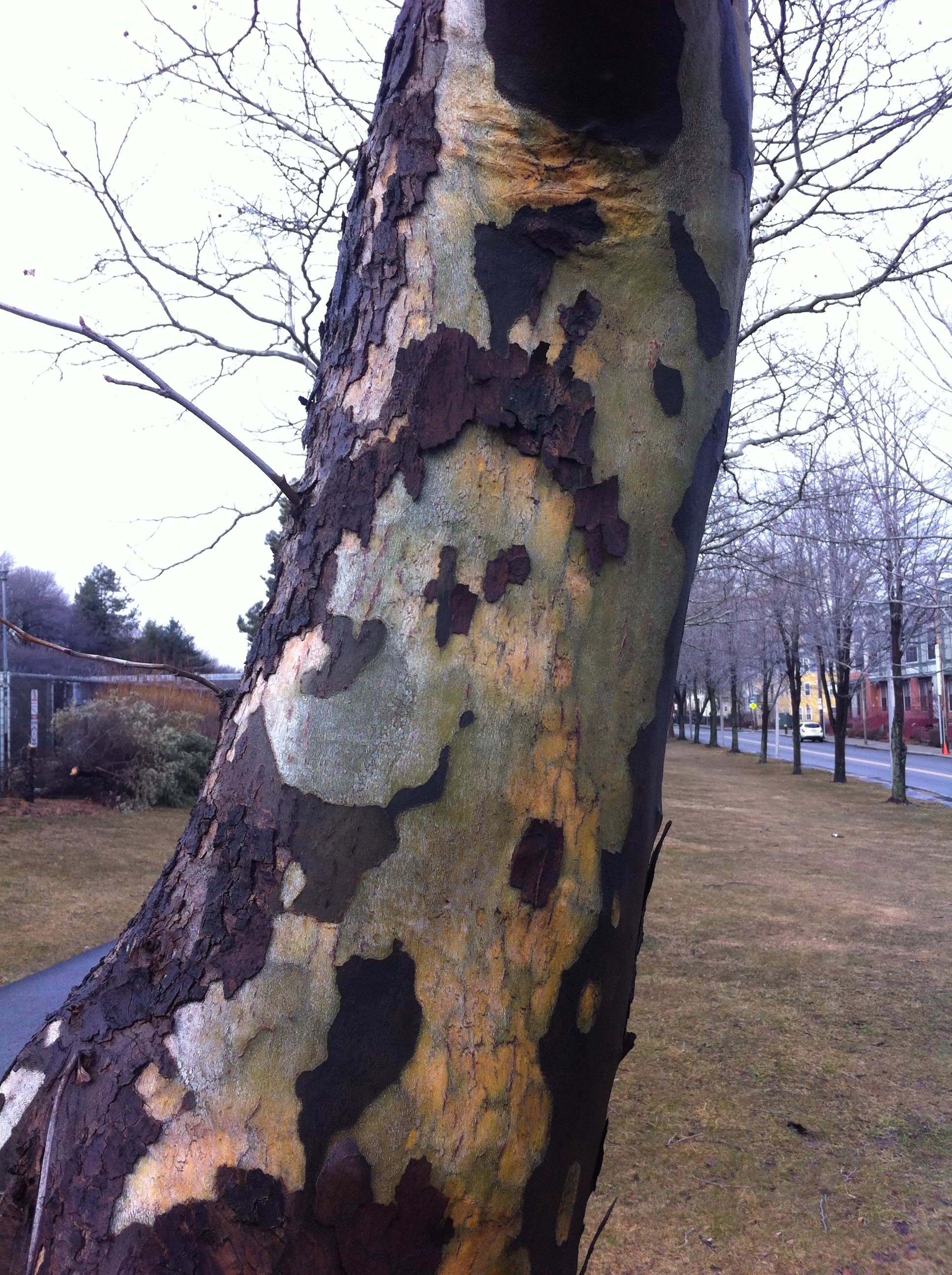
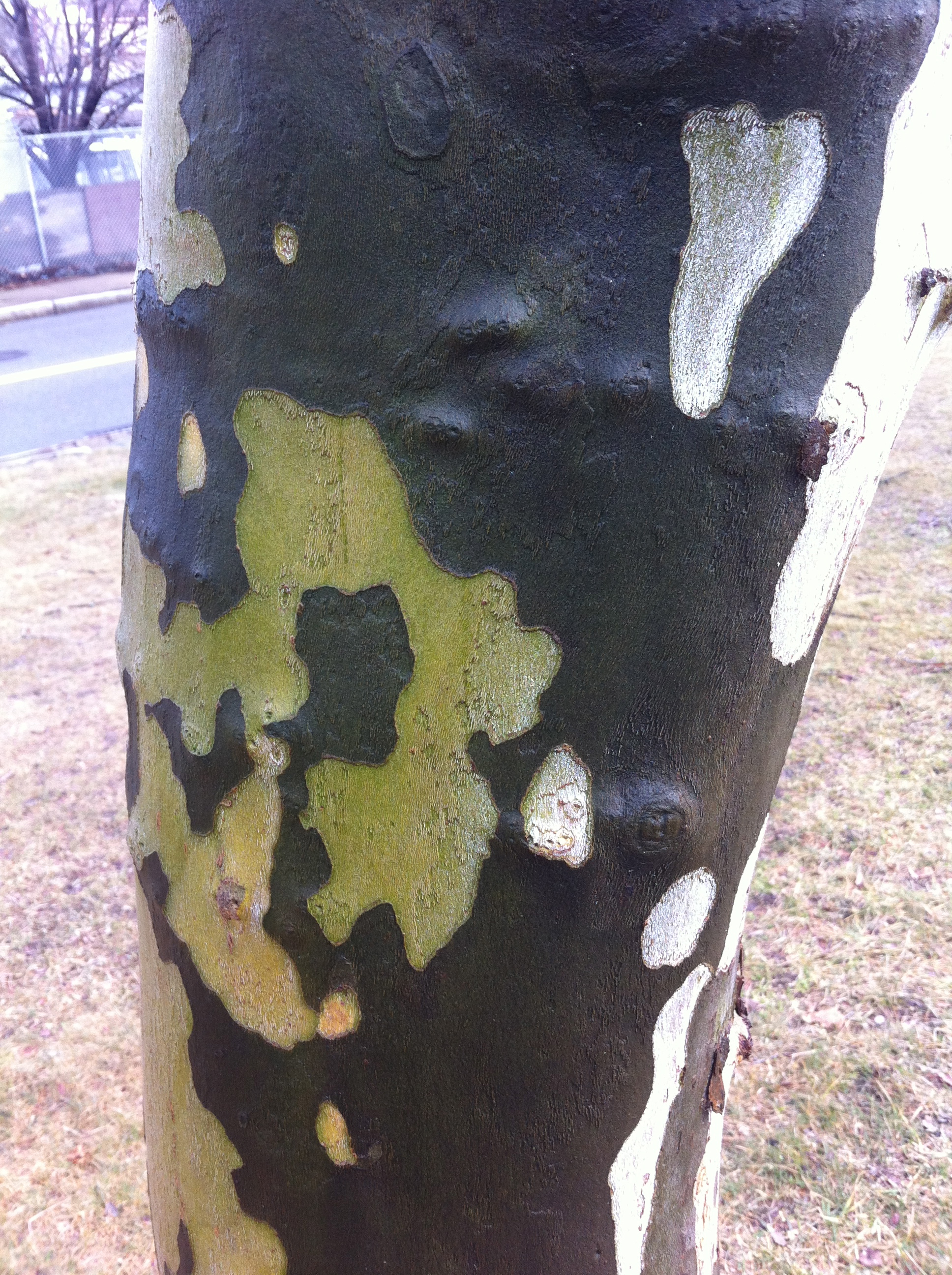
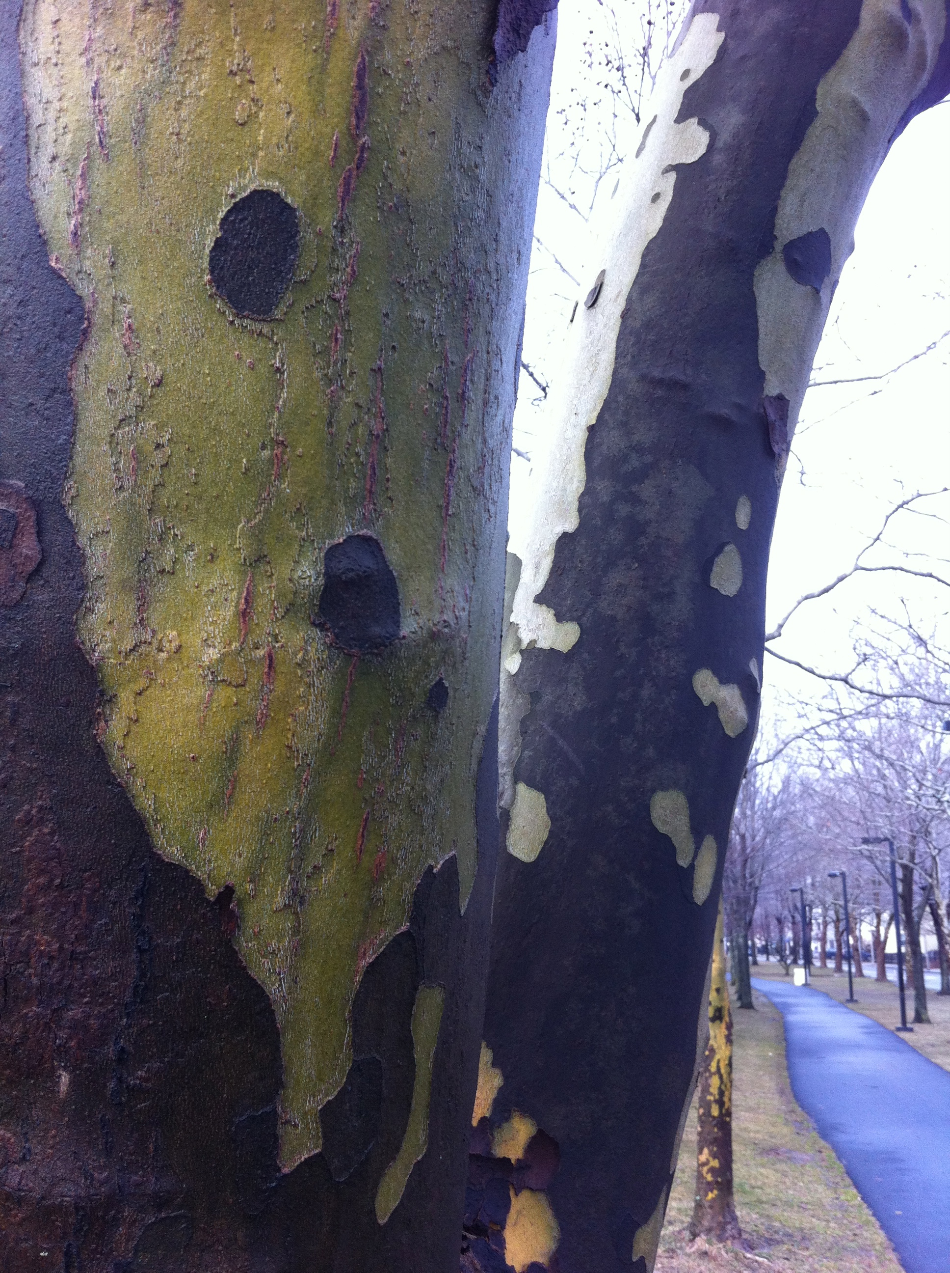
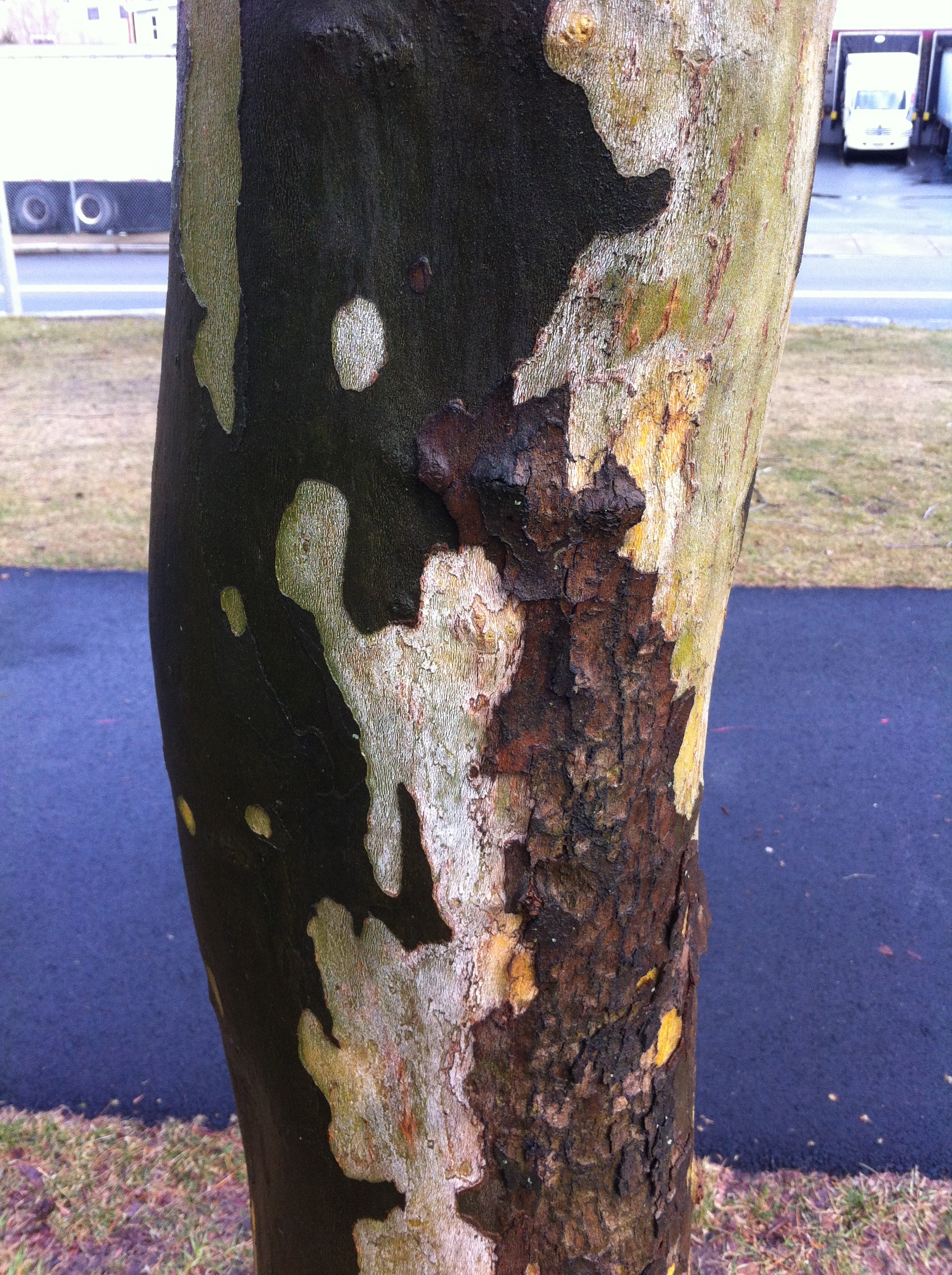
Read MoreWalking for color (and some Beeches for real this time)
Now, I am not the sort of person who has ever been remotely interested in painting the landscape. Seriously, it was something I did when I was in school but I was never very good at it. Then I went to Skowhegan and I met amazing painters who were really committed to painting the landscape (like Ellen Altfest, Frank Meuschke, Lois Dodd, and Yvonne Jacquette) and I knew I didn't have that kind of commitment in me for the landscape.
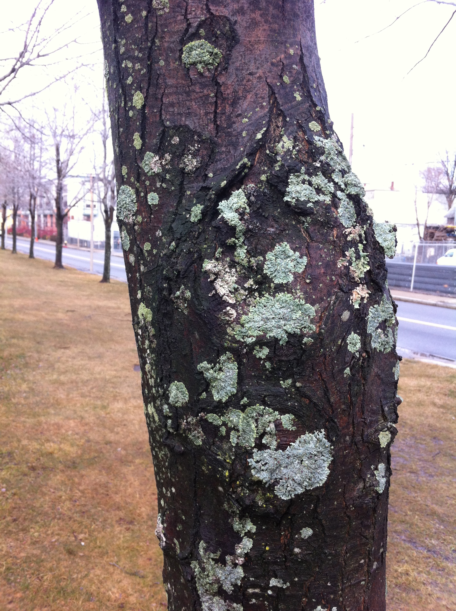
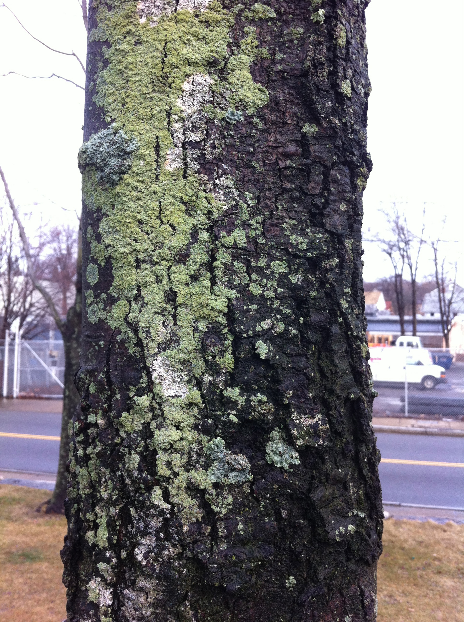
I will say that the color in the landscape has become very urgent for me lately. Specifically, the way green is becoming a situation for color. I start thinking what it could mean to formulate a painting where varieties of green are the basis for the color relations. So I've been walking in the landscape a lot lately and looking at trees. And mixing that color when I get home.
Beckmann makes other painters look like scrubs
 A detail from the glorious "Self-portrait in a Tuxedo" (1927) on view at the Harvard Museums weird ass "greatest hits" installation at the Sackler. Everyone is usually kvelling over his use of black but the joy is the chromatic shadows in the face. You can see this painting and then go look at the Poussin's upstairs and wonder how people could ever think that making a shadow was a matter of adding black.
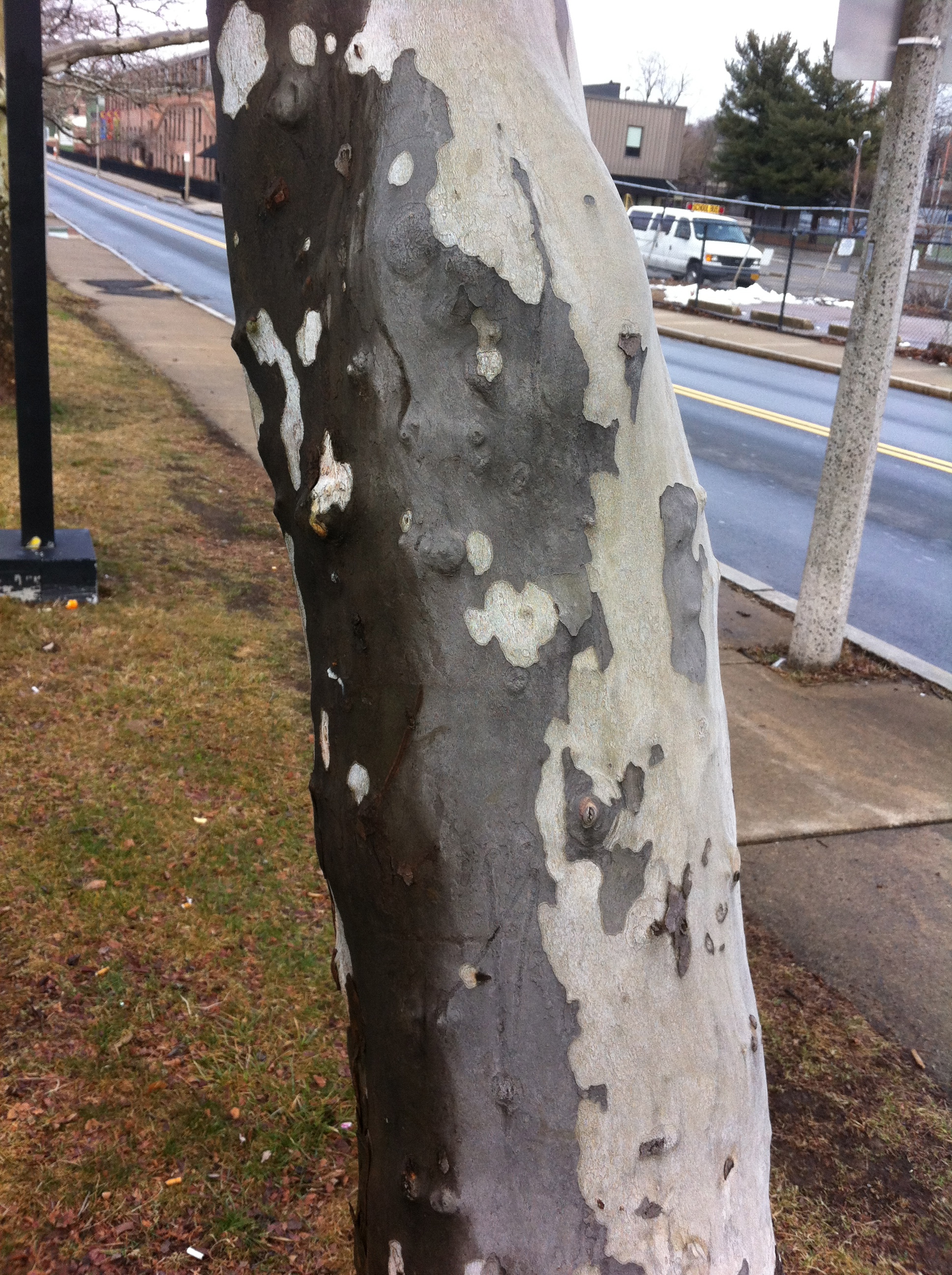
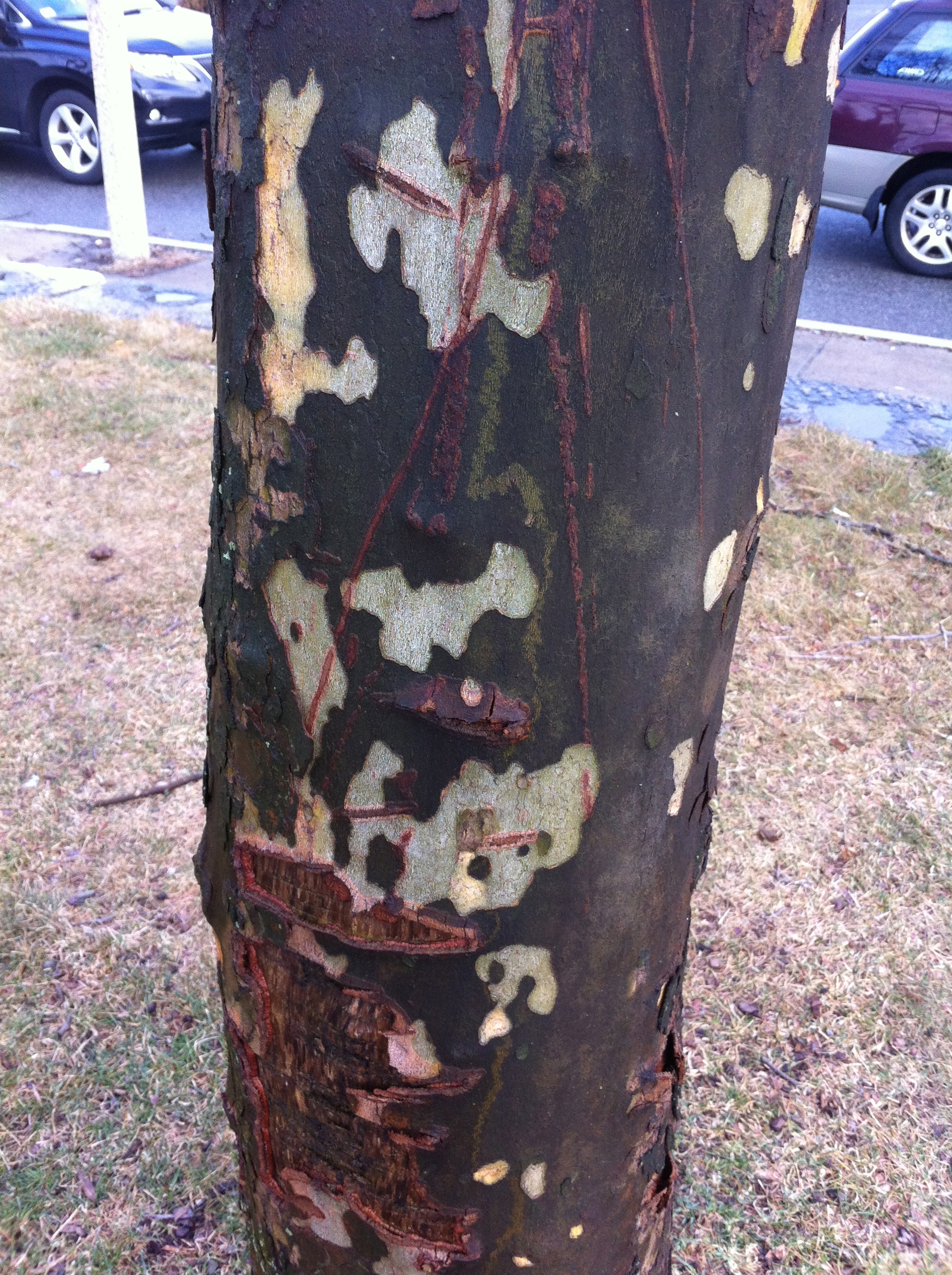
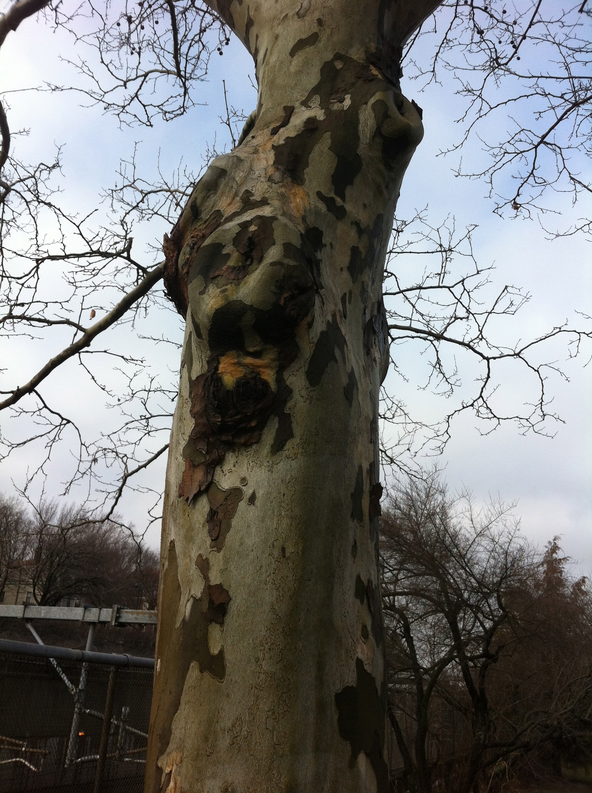
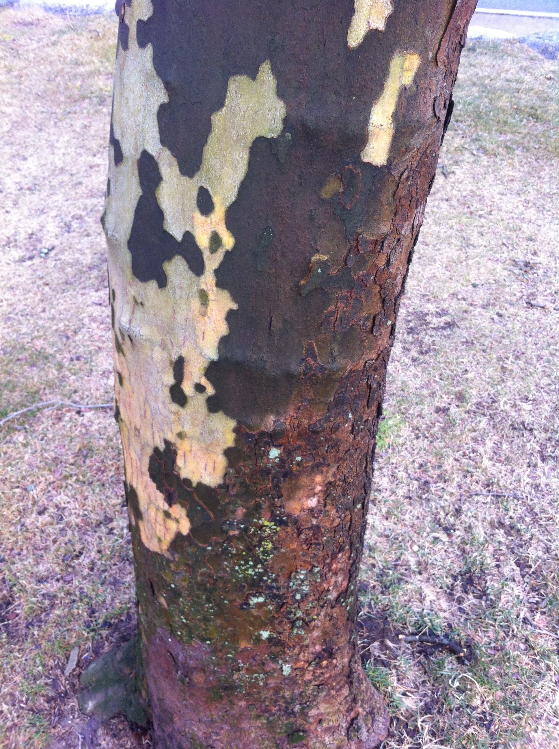
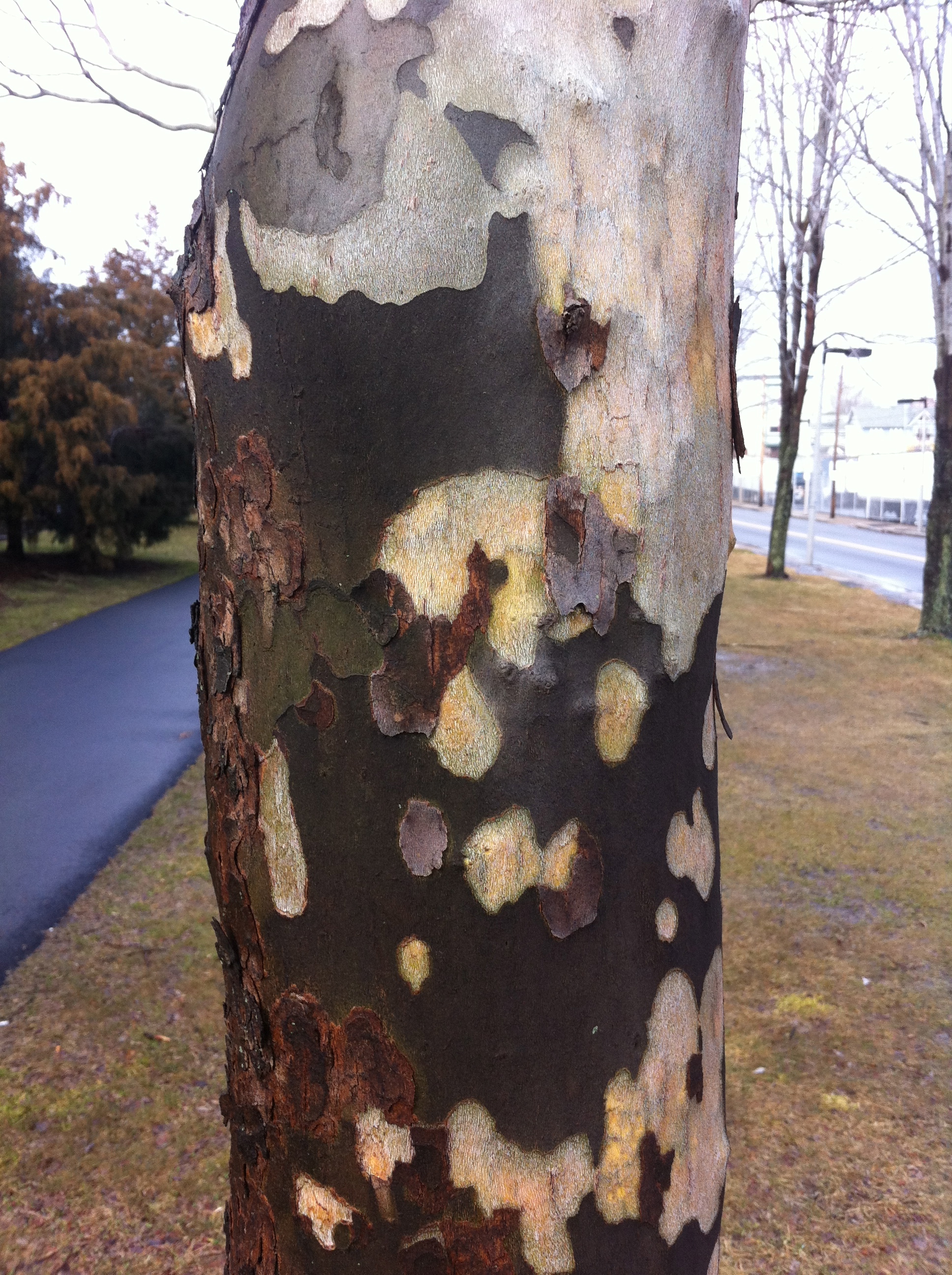
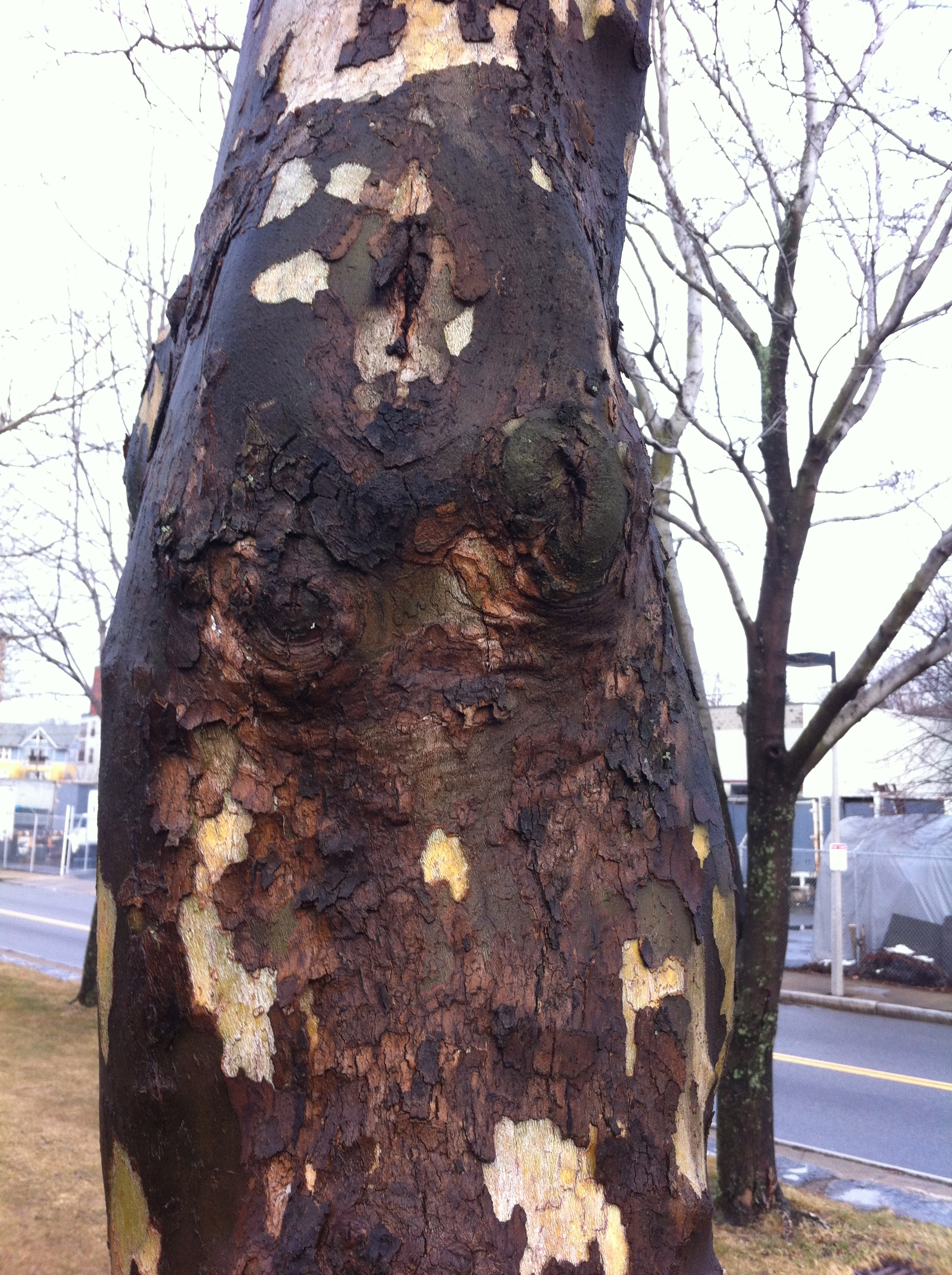
London Plane trees, Southwest Corridor park, Jamaica Plain
Lessons from a Music Lesson
 I was walking through the Museum of Fine Arts, Boston the other day. I was having a particularly nasty studio day. Nothing was going well and every color I tried to mix ended up as mud. I figured I should go look at the work of people who knew what they were doing before I did anything else.
I ran into Elliot Bostwick Davis in the gift shop and we chatted briefly about the coming hurricane. Elliot is the John Moors Cabot Chair of the Art of the Americas and as such she is responsible for the new Art of the Americas Wing at the MFA. Personally, I love her for getting all of those Gilbert Stuart paintings back on the walls. I hadn't seen her since she did a panel discussion with Fred Wilson at Northeastern University so it was good to see her and catch up a little. We were both super worried about the effects of the storm on our neighborhoods (she's in Dedham, I'm in Hyde Park).
I didn't have a destination on this trip. Sometimes I go to the museum to look at something specific, but when I have a bad studio day, I prefer wandering. I find that my blocks in the studio mean that I need to see something in a new way. When this happens I know that I am looking for something and I am certain that I will recognize it when I see it. It may not even be something in the museum, but I know that I have to get out of my studio and look at some stuff - stuff that has nothing to do with me.
There's a Manet in the MFA collection called The Music Lesson. I hadn't seen it in a long time and it was up in the French room on the second floor. It's a double portrait of Zacharie Astruc and a woman holding sheet music. I'm certain this woman has a name and for a long time I thought it was Madame Manet but I have since learned that it isn't her. Because I hadn't seen it in a while, it was fresh to me.
It was like seeing someone you think is really attractive and then you realize it is someone you know and were in love with at some point.
What struck me this time in seeing it was how dark the painting is. It's very dark, but it doesn't feel flat. That was at odds with how I was experiencing the color. The restricted palette (save for the edge of the oriental carpet) still indicated a tremendous sense of weight and volume in the dress and in the full face of the woman. It was not a Cezanne solution where color next to color built up the weight of the image and it wasn't a picture that relied solely on drafting to create that illusion of weight (like Matisse). I looked at it for a long time and I was sort of stupefied as to how a picture so devoid of color interval and concessions to raking light could have such a dramatic physicality.
 Anne Coffin Hanson has an essay called "Manet's Pictorial Language" that I never really understood until now. In it she talks about Manet as a painter who is thinking deeply about how we see and the way the facture of the painting contributes to the understanding of the image. She talks of Manet's brush "caressing" the contours of the figures. I can see it in this picture so clearly. Manet changes directions, applications, touch, and weight in this picture so often that a close investigation reveals the way that he is using mark and directionality to not only guide the eye, but to describe form. This I think is what allows him to create this mass of volume and in the fabric and the feeling of movement in the portraits. He is using the brush not just to depict the things in the painting, but he is moving the material of the paint into eddys and pockets that maintain their force as physical marks that convey a sense of volume. And it seems to me that he did it at the expense of a broad palette to focus the viewer's eye on the intervals of marks rather than those of color.
There is very little difference in color in the faces. Even the rosiness of the cheeks of the woman seem to be glazed rather than directly painted (which probably explains why they feel more like make-up). It is Manet's invention in the making of the marks that is creating the exceptional ease of the portraits and the immediacy of the painting.
Until now, I never really thought of Manet as someone who was developing a new language through mark making. I think I was so overcome by his compositions and directness, I never gave much thought to how he got to the wonderful economy of his pictures. I think a lot of painting focuses on obvious mark making as evidence of emotion or labor. In the Music Lesson, Manet equates touch and volume by invention of a system of marks that reveals itself on close inspection. It makes me want to reinvestigate the color sensations of other double portraits like In the Conservatory, or Boating to see how much of what I am reading as space is due to color and how much is related to directionality and mark making. The subtlety of Manet's inventions and the broad effect of them are clearer to me now.
And so back to work.
Thank you, Headmaster....
 "Headmaster is an assignment-based queer print publication based out of Providence, Rhode Island. Smart and sexually provocative, Headmaster appeals to a discerning audience of man-lovers." That's what it says on their website and it is very true.
I got a very sweet email (after a particularly shitty day teaching) from Jason Tranchida, one of the editors of Headmaster. He told me about the magazine (I loved name) and sent me a copy. I loved it and was thrilled that he and the editors were considering me for an assignment.
The email containing my assignment was very enigmatic:
"Choose three or more characters from various works of literature.
Create a series* of paintings placing these characters in a single contemporary context.
The paintings, as a series, must expose the characters’ relationships to each other.
* 5–7 paintings."
I was a bit stupefied. I could not for a second imagine how to do something like this but Jason (like any good headmaster) clarified things for me. I got another email from him and after reading it I started thinking about Fassbinder's Querelle. I watched the movie years ago but I felt the urge to see it again. I was really in love with Brad Davis.
I created a suite of paintings called for genet that you can see in Headmaster No. 2. This issue also features the work of Stéphane Barbier, Jesse Burke (who also took the stunning cover photograph), Heyd Fontenot, Krys Fox, Steven Frost, M Kitchell, Johnny Murdoc, Joseph Segal, and Thomas Weidenhaupt. The work, layout, and presentation are sexy, elegant, and captivating. It's great company to be in.
Being away...
 A lot of things come to light when you are away from home. Don't get me wrong. I am not saying "I am on vacation and things are GREAT!" I am talking about discovering something about how I am based on being in a different place, a different location, a different light. I am making different paintings because the light of Savannah is different than that of Boston or of Central Maine. That sort of goes without saying. What I am getting at is this trip to Savannah has put some things in plain view. Things I try hard not to think about.


